From Unlock15
Evidence
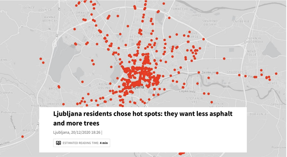
Collaborative heat maps
Websites like mapperoni and uMap let you create maps with layers in a minute, embed them in your site or share them with others to contribute. An example: The urban design office prostorož invited citizens of Ljubljana in 2020 to vote for locations they experience as hot. In three weeks, they cast around 700 votes. The data was consistent with the locations of heat islands measured by satellite thermal imaging. The responses showed that people change routes and habits in the summer or avoid certain locations in the city altogether due to the heat. Respondents also suggested their own cooling measures - they want more and bigger trees, less asphalt, less concrete, and less parking spaces. This map was then published in newspapers and reached a big audience.
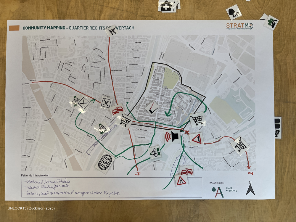
Community mapping
Collaboratively mapping maps about a neighbourhood can shed light on factors that influence everyday transport-related decisions.
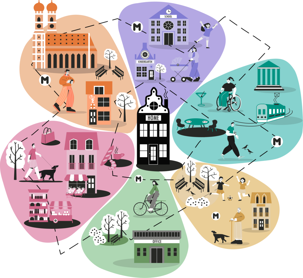
Measuring the 15-min city: Flowers of Proximity
The flowers are a planning tool that invites participants to look beyond their current travel routines by imagining instead how they would like to get around. This perspective grounds accessibility planning in people's needs and desires, helping make cities more livable, sustainable, and fair.
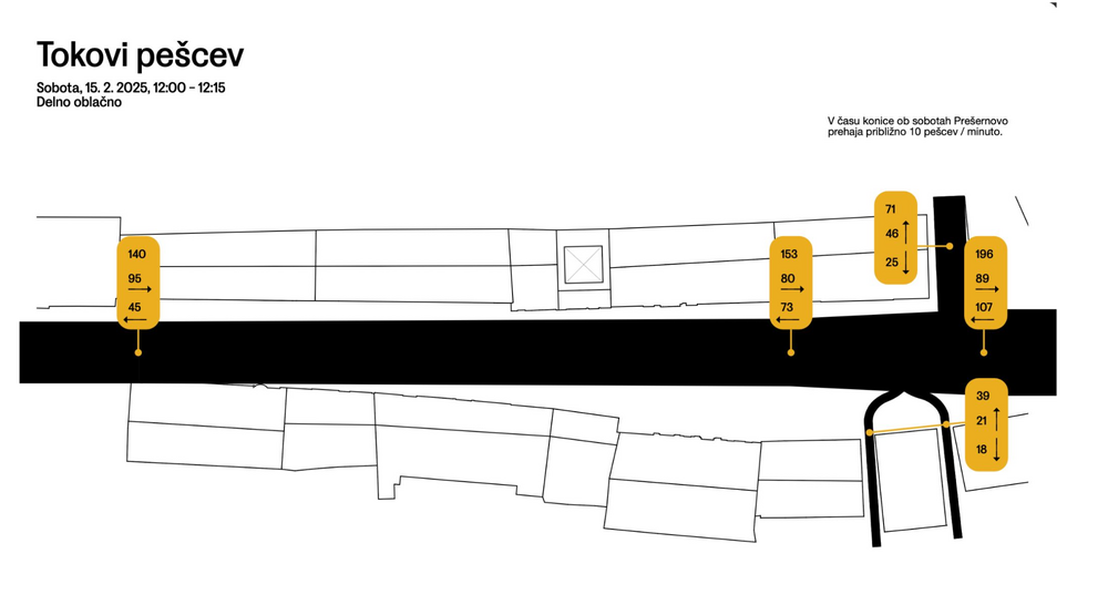
Observing and visualising human behaviour in public space
Collecting data on how people use space can give you a solid foundation to discuss how it should be designed. The free public live app helps you to collect the data you need when observing people. The second link leads you to a website where you can download an analog version with excel sheets. The picture is an example how you could visualise the collected data, done by urban design studio prostorož.