From Unlock15
15min-City online Maps
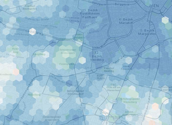
The map shows how close services are if one lives in different areas of the city: in red areas the time needed to access the closest services is on average higher than 15 minutes, while the blue are 15-minute areas. We consider the average time of accessibility to the closest 20 POIs.
Observing and visualising human behaviour in public space
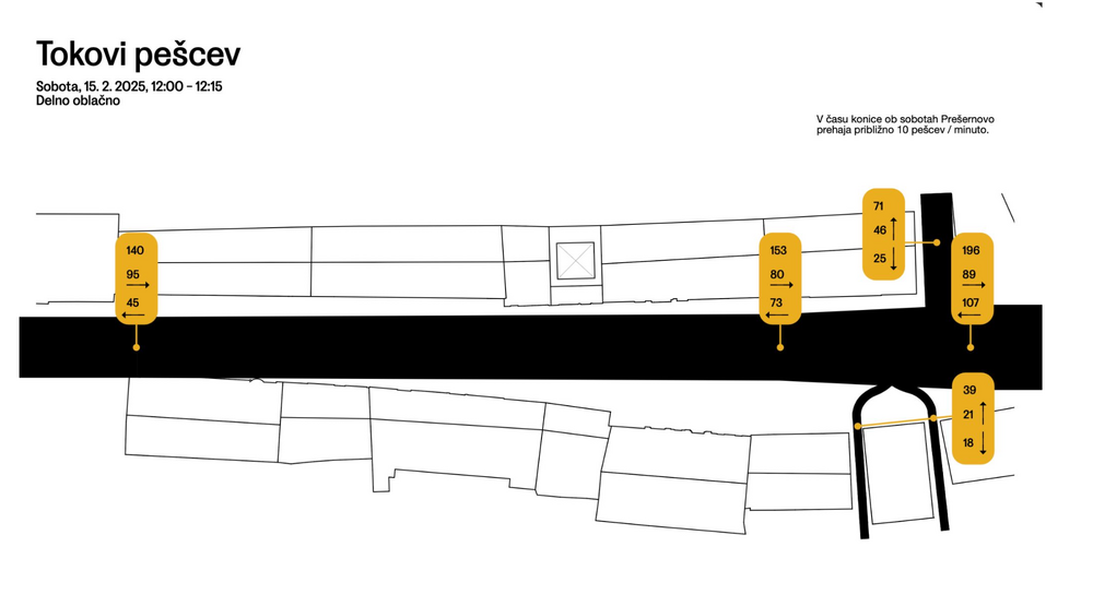
Collecting data on how people use space can give you a solid foundation to discuss how it should be designed. The free public live app helps you to collect the data you need when observing people. The second link leads you to a website where you can download an analog version with excel sheets. The picture is an example how you could visualise the collected data, done by urban design studio prostorož.