From Unlock15
Evidence
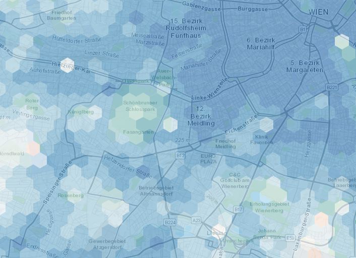
15min-City online Maps
The map shows how close services are if one lives in different areas of the city: in red areas the time needed to access the closest services is on average higher than 15 minutes, while the blue are 15-minute areas. We consider the average time of accessibility to the closest 20 POIs.
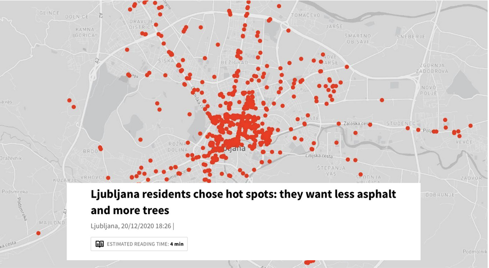
Collaborative heat maps
Websites like mapperoni and uMap let you create maps with layers in a minute, embed them in your site or share them with others to contribute. An example: The urban design office prostorož invited citizens of Ljubljana in 2020 to vote for locations they experience as hot. In three weeks, they cast around 700 votes. The data was consistent with the locations of heat islands measured by satellite thermal imaging. The responses showed that people change routes and habits in the summer or avoid certain locations in the city altogether due to the heat. Respondents also suggested their own cooling measures - they want more and bigger trees, less asphalt, less concrete, and less parking spaces. This map was then published in newspapers and reached a big audience.
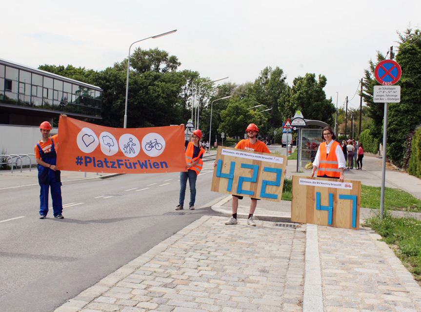
Staging evidence for safer school streets
Excel sheets come to your mind when thinking of evidence? Think twice! The initiative "Wir machen Wien" showed powerfully how to not only collect valuable evidence, but also how to stage it in a dramatic way. They counted bikes, pedestrians and cars in a street in front of a school. The data showed a vast majority of the users (422) use the street by foot or bike. Nevertheless, the street is designed for cars, that represent a minority of the users (47). They designed wooden signs that clearly showed this discrepancy to passers-by, which sparked conversations. They also staged a photo, that you can see attached. They used the photo in a press release, which made local newspapers cover the story.