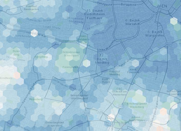
15min-City online Maps
Collaborative heat maps
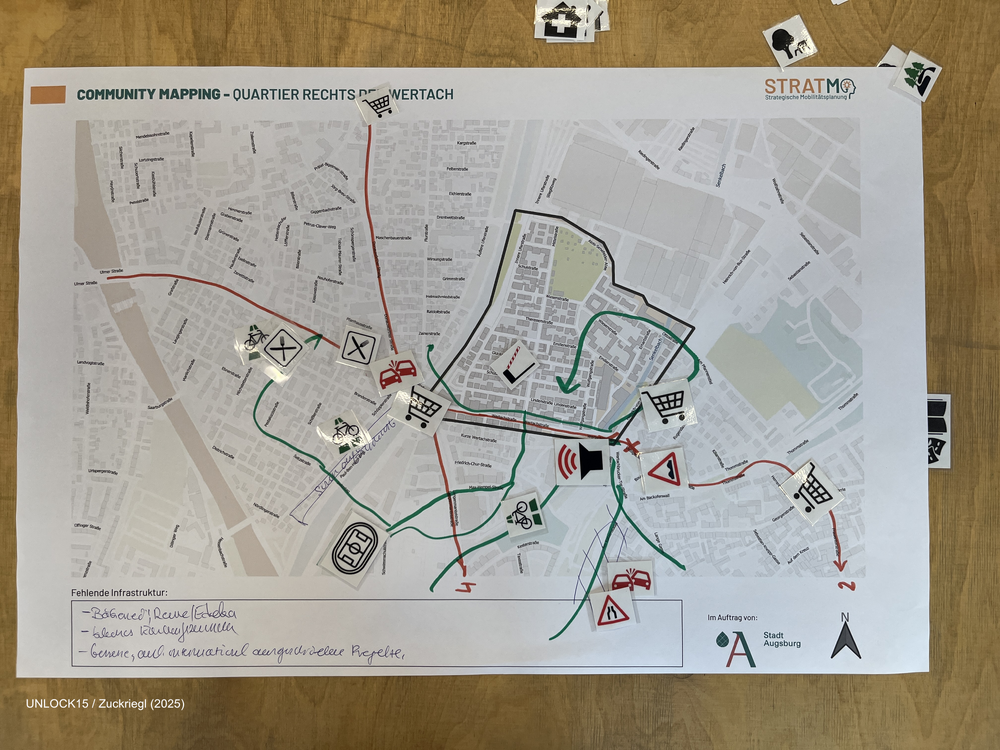
Community mapping
Joint Survey between initiatives and district politics
A joint survey between district politics and initiatives has potential to drive change. A survey means to ask inhabitants of an area what they like or don't like about status quo and what they want to change. The initiative has local knowledge of the area and knows what is important to ask. The survey results give politicans guidance what kind of change is backed up by the inhabitants. From our experience a joint survey is possible when
- all involved people are amicable towards each other
- there is a third neutral party (for example science project or neighbourhood management) that coordinates the process
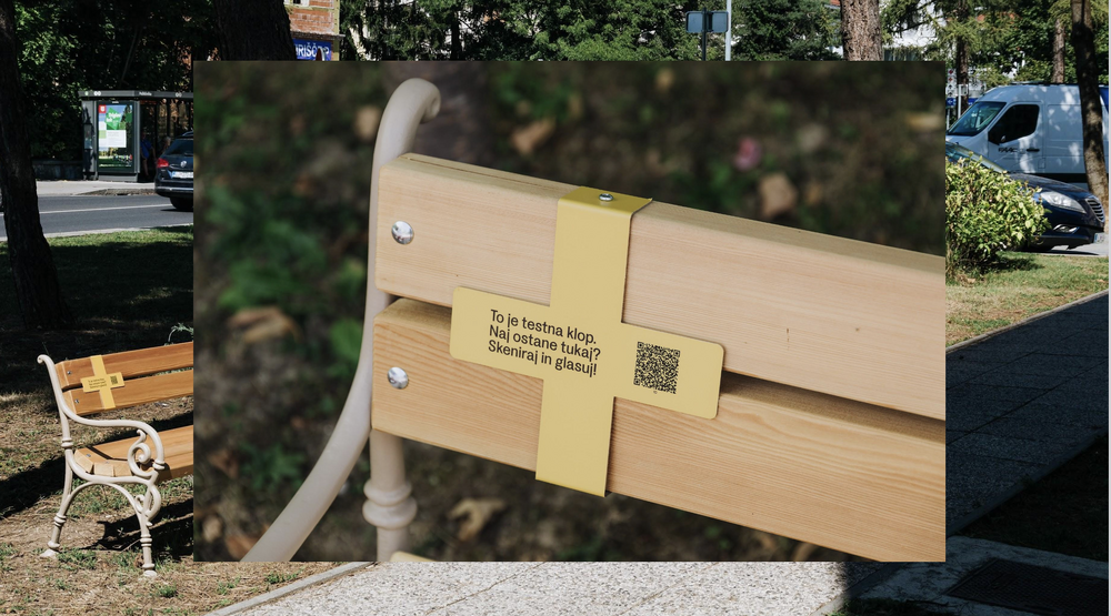
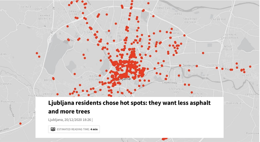
Low effort survey in public space
The picture stems from Ljubljana, where the urban design studio prostorož set up benches in public space. They attached a QR-Code, where people could vote if they wanted this bench to stay. In a short period of time about 400 people voted, that they would like the bench to stay because they frequently use it. On this basis prostorož talked to the people in charge of that area. The survey was enough evidence for them to let the benches stay! What a success!
In case this inspires you to take action: Make sure that the QR-code is made out of solid material, that endures the time you want the survey to last. The tool material link will lead you to a website where different survey tools are offered, a lot of them without additional costs.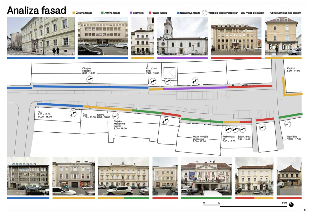
Mapping and analysing facades
"We need parking space otherwise our shops will die!" This is an argument often brought forward by opponents of street transformation. The urban design studio prostorož confronted this claim with evidence. They analysed the facades of the street by the following categories: Lively facade, active facade, monument, empty facade, unremarkable facade. They could show that a lot of the ground floor was at that point in time not occupied.
prostorož combined this analysis with analysing parking place occupancy and human behaviour to build an even stronger argument: A street full of cars is not helping shops at the moment. By combining all these analysis they managed to convince the decision makers to give that street a human friendly makeover!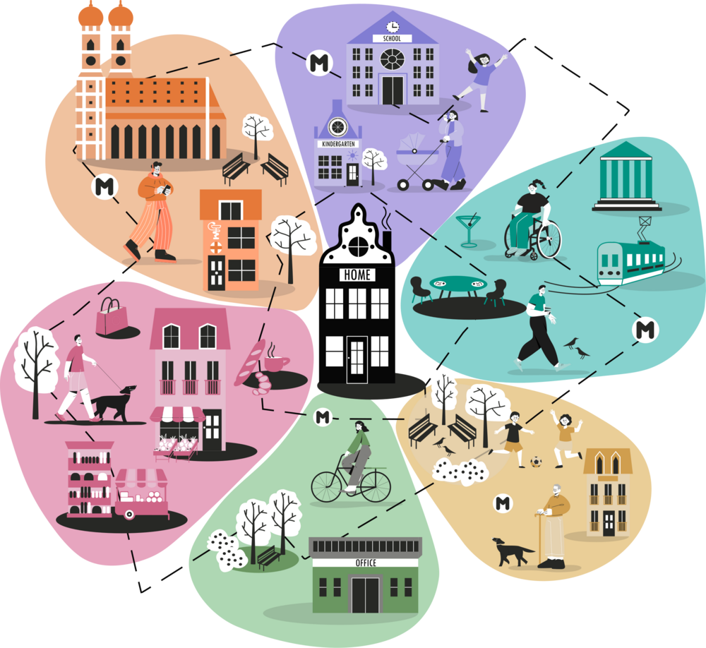
Measuring the 15-min city: Flowers of Proximity
Measuring the sustainability of streets